Reading the Smoke Chart
The percentile bands, the loss colours, the baseline, the no-reply markers and the windows: how to read what network monitoring draws for one host.
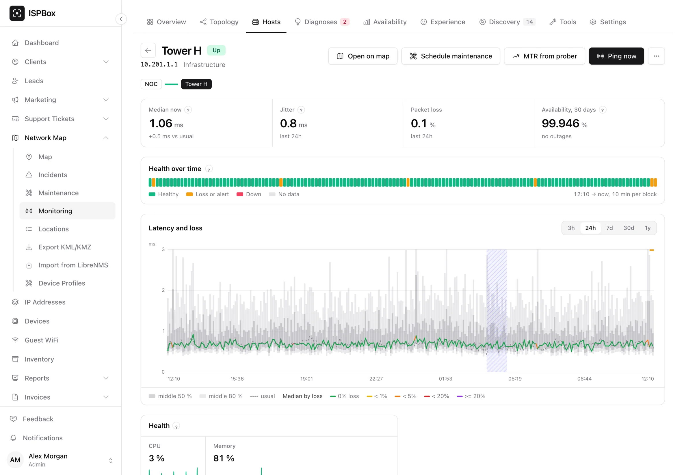
Every measured host has its own page under Network Map > Monitoring > Hosts, and the thing on it worth learning to read is the smoke chart. It is one picture of one host over one window, and it answers three questions at once: how fast the replies came back, how much they varied, and how many never came back at all.
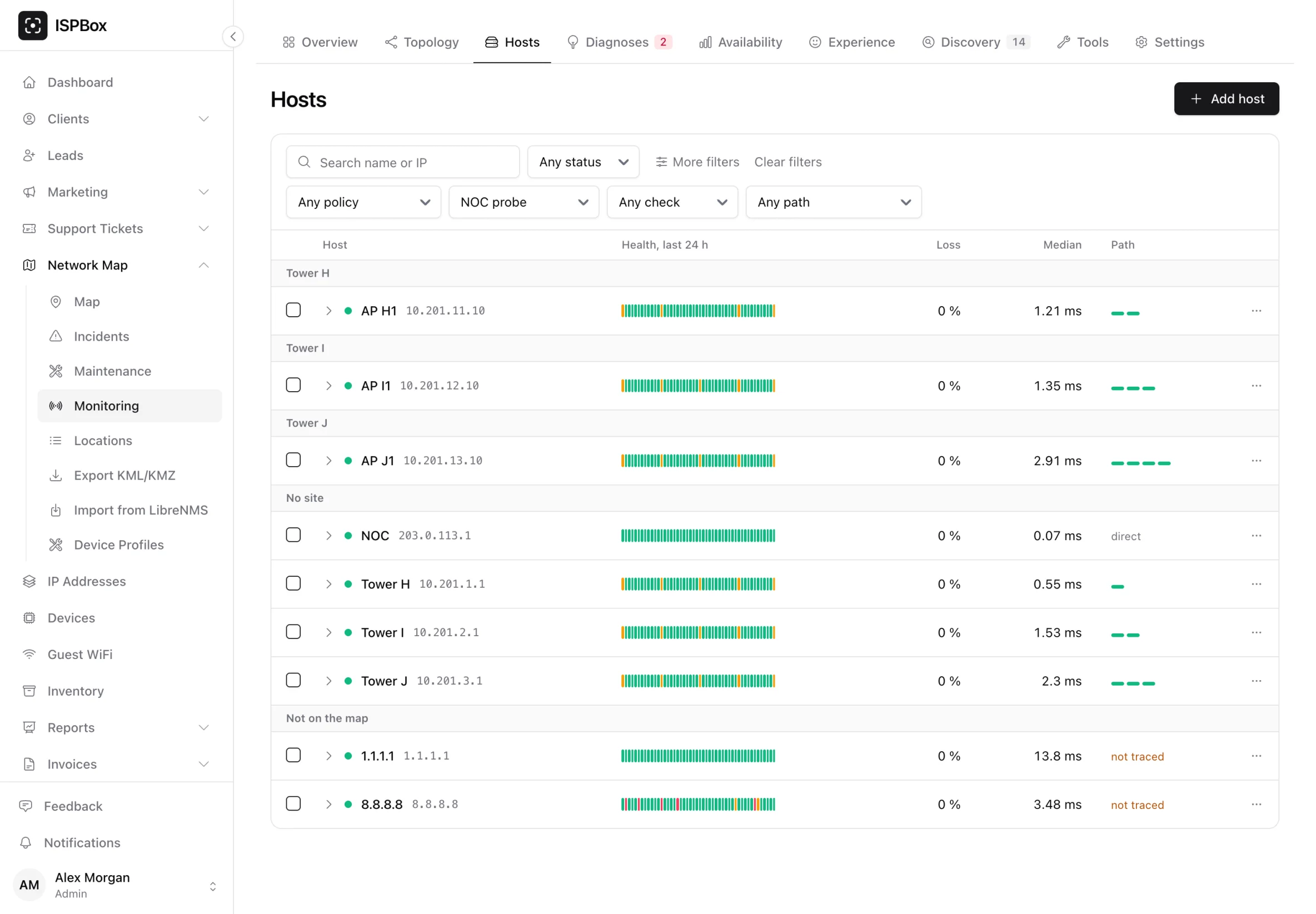
The tree that gets you there is grouped the way the map is: site, then device, then the hosts on it, with a status dot, a health strip of the last 24 hours, the last loss, the last median and the path state on every row.
What the chart draws
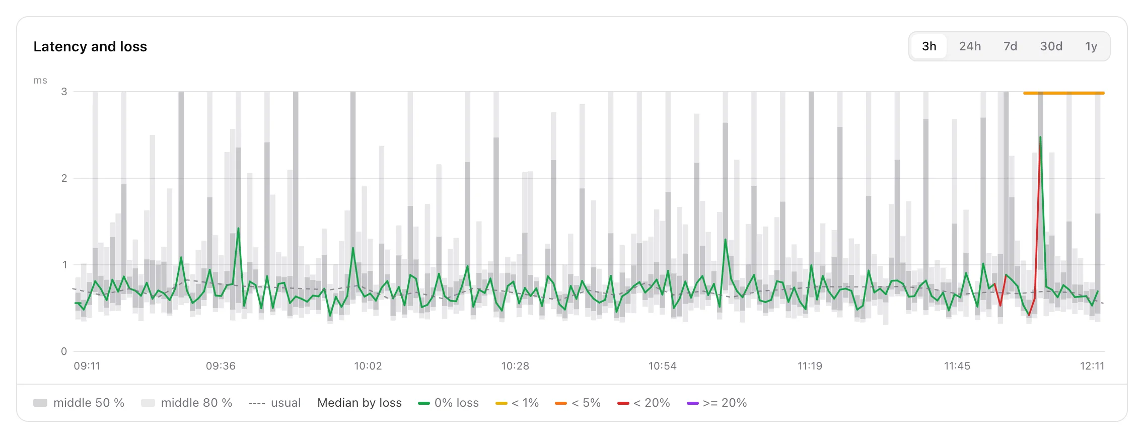
Each cycle the probe sends a burst of packets to the host - 20 of them a second apart, by default - and keeps every round trip time, not just an average. The chart shows the shape of that whole distribution:
- The pale outer band (middle 80 % in the legend) is the 10th to 90th percentile of the round trips in that slot. A wide band means the replies were all over the place.
- The darker inner band (middle 50 %) is the 25th to 75th percentile - where most of the replies actually landed.
- The line through the middle is the median.
- The dashed line (usual) is the baseline: what this host normally does at this time of day.
This is the "smoke" that gives the chart its name. A flat line with no smoke around it is a clean path. A thin line with a puff of smoke above it is a path where most packets are fine and a few are late - jitter, usually a congested or a marginal radio hop. A thick band that stays thick is a path that is simply variable.
The colours are packet loss
The median line is not one colour. Each segment is coloured by how much loss that cycle had (Median by loss in the legend), so the colour of any segment tells you the loss without reading a second chart:
- green - 0 % loss
- yellow - under 1 %
- orange - under 5 %
- red - under 20 %
- purple - 20 % or more
The same legend is printed under every chart. Hovering a point says the loss percentage and the received-out-of-sent count out loud, because a colour is not a number.
When nothing answers at all
A host at 100 % loss has no round trip times, so there is nothing to draw a line from. Rather than showing you an empty chart - which reads as "we measured nothing" when the truth is "we measured, and nothing answered" - those cycles are drawn as ticks on the floor of the chart in the worst loss colour, and a run of them as a tinted band, captioned no replies when it is wide enough to read.
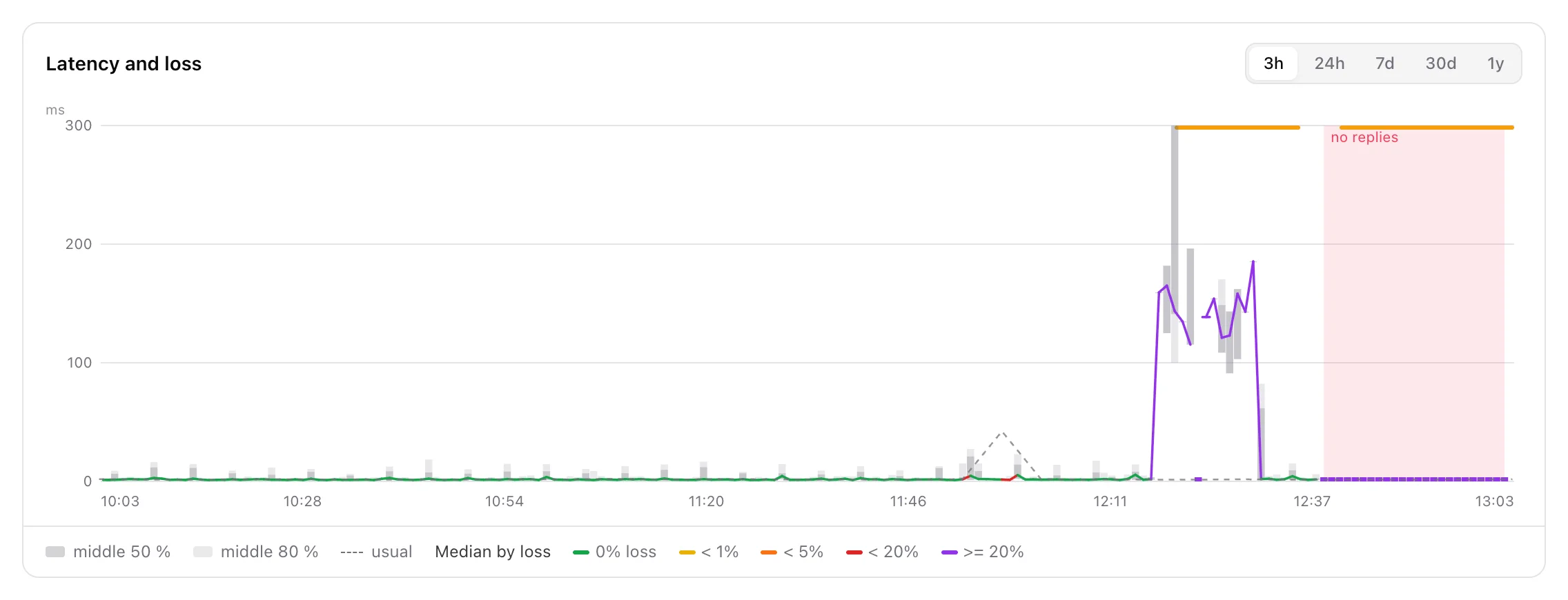
Alerts are the thin strip along the top of the chart: whenever an alert opened and closed on this host (packet loss, a latency spike), the window it covered is marked there, and hovering it names the alert. A host down alert needs no strip of its own - it is the tinted band. Planned maintenance is a hatched band behind everything, so an outage inside a maintenance window reads as the planned work it was.
Gaps are drawn as gaps
If the probe itself was offline for an hour, the chart does not join the two sides with a straight line, because that reads as "we measured, and it was fine". Two readings more than about three steps apart - a step is a cycle at raw resolution, an hour or a day in the summaries - get a break in the line instead. One or two missing cycles are joined over: that is a late sample, not an outage.
Windows, and where the numbers come from
The buttons above the chart are 3h, 24h, 7d, 30d and 1y. The window decides which table answers:
- 3h and 24h - raw cycles. Every percentile is computed from every individual packet, so these are exact.
- 7d and 30d - hourly summaries. Percentiles over every packet of the hour.
- 1y - daily summaries. A day folded from its own hours.
On a summary window an Every cycle button switches the chart to cycle-level data for the same window, and Summary switches it back. A day that had to be derived from its hour rows rather than from the raw packets puts an approximate tag next to the chart title, so you know when a percentile is a good estimate rather than an exact answer. The window also rides in the address bar, so a chart on a particular window can be linked to and shared.
Pulling an older window back from the probe
The panel deliberately keeps only a short working set of cycle-level data - 7 days by default, tunable between 3 and 30 on Settings > Network monitoring > Sync. The long archive lives on the probe itself, for 90 days or for as long as its disk allows.
So when you press Every cycle on a window that reaches back past that, the panel does not say "no data". It asks the probe for the missing part (at most 31 days per request, newest first), says Loading older data from the prober..., and refreshes the chart when the answer arrives - usually within a minute, since the probe picks the request up on its next configuration pull. Fetched data is cached for a week and then dropped again. If the probe is offline or revoked, nothing is requested, and the page shows when the probe last reported.
The rest of the host page
- Path - under the name, the devices and links between the probe's anchor and this host, nearest first. Each link is coloured by its current verdict, so a red one is the link being blamed for this host's trouble. Click a link to open the link page. When no single path can be traced, a line under it says why.
- The four figures - Median now against what this host usually does at this time of day, Jitter and Packet loss over the chosen window, and Availability, 30 days, which opens the availability report. A host that did not answer the last cycle says no reply to the last cycle.
- Health over time - a strip of blocks above the chart: green when every packet came back, amber for some loss or an open alert, red when the host did not answer or lost half the packets, grey for no data.
- Events - the alerts on this host, open ones first, with acknowledge and snooze on the open ones.
- Details - which probe measures it, its alert policy, whether it came from the map or was added by hand, and for a device the model, firmware and an on/off switch for SNMP health.
A device also shows its health readings, its device log and its customers' experience when those exist.
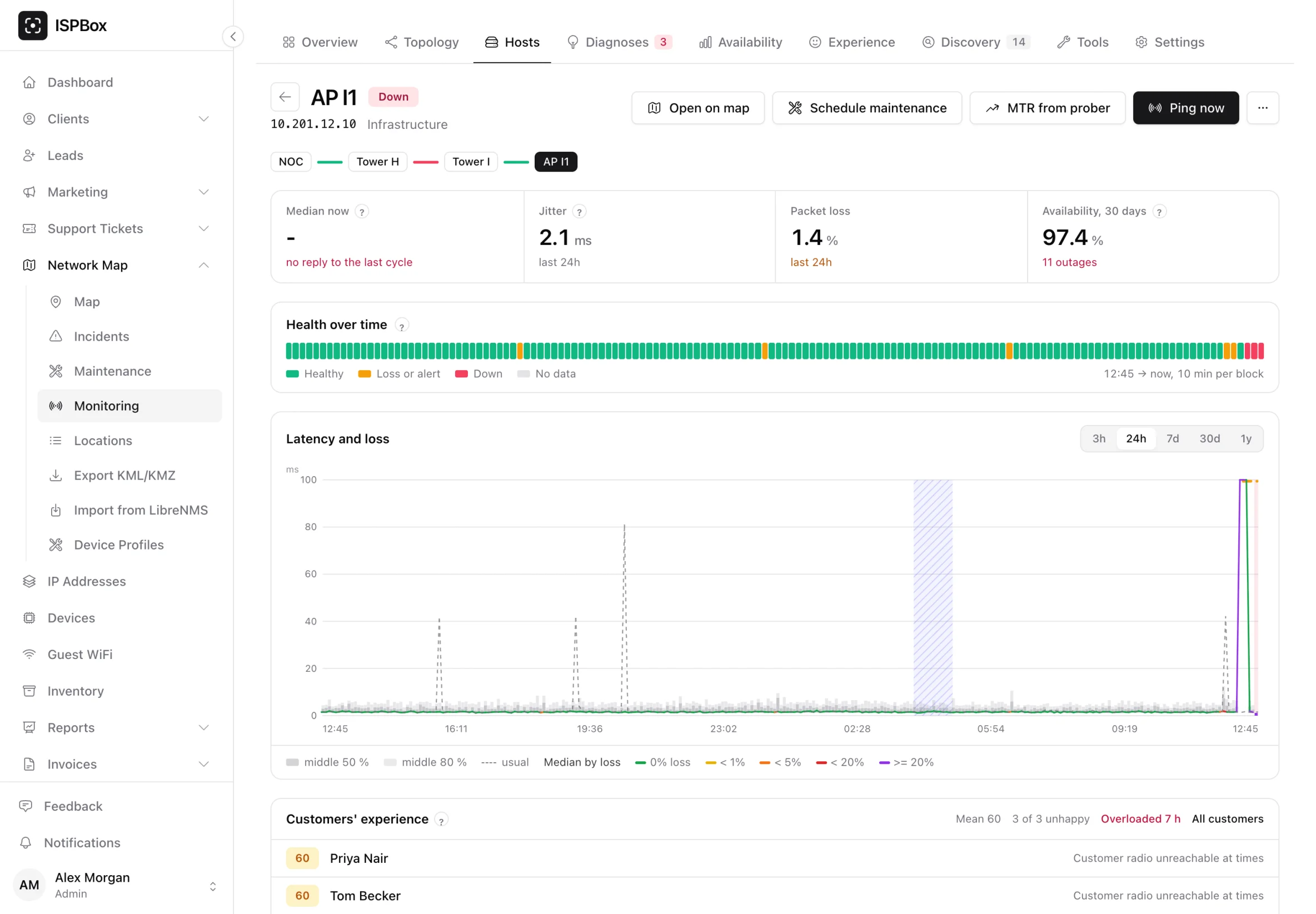
The buttons at the top are Open on map, Schedule maintenance, MTR from prober and Ping now, which queues a single out-of-cycle measurement the probe picks up on its next configuration pull. The ... menu holds a 100-packet ping, Test SNMP and Pause monitoring. The alert policy, which decides which alert thresholds apply, is changed in the Details panel.
The same chart elsewhere
The smoke chart is not only on the target page. The same picture, from the same builder and with the same colours, appears on a client's page and in a ticket sidebar for that customer's own connection, and on an incident page over the window the alert actually lasted. In a ticket there is also an Attach 24 h chart to ticket button, which files the picture the browser already drew as an attachment on the ticket.