Network Topology
Every tower, access point and link as one diagram, drawn from the core outwards and coloured by what the monitoring measures right now, with saved views, a wall mode and a 24 hour replay.
The map shows where your equipment stands. The topology shows how it is connected: every tower, access point and link as one diagram, drawn from your network's core outwards, coloured by what the monitoring measures right now. When something breaks at 2 a.m., this is the page that tells you in one look which link is the cause and how much of the network hangs behind it.
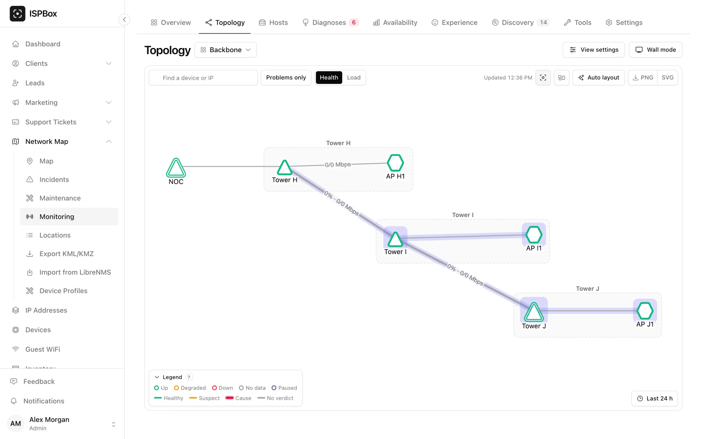
Open it from Network Map > Monitoring > Topology. Nothing has to be set up: it is drawn from the devices and lines you already have on the map and from what the probes measure.
Reading the diagram
- The core is on the left. The layout starts at the device each probe is placed on and ranks everything else by how far it is from there. Your upstream providers, if they are on the map, get a column of their own in front.
- Every link is drawn, including rings, backup links and two links running in parallel between the same sites. The overview tree shows one way to each device; the topology shows all of them, so a ring that just lost one side is obvious.
- Device colour is its status: up, degraded (losing packets or slow), down, no data, or paused.
- Link colour is its verdict: healthy, suspect, or the cause of a problem. The cause is drawn thick and highlighted, whatever else is going on.
- Labels show the load: how full the link is and the current rate in each direction, when its interfaces are bound in Edit link. Line width follows the link's capacity.
- Customers are one bubble per device, for example "41 CPE · 2↓" (41 customer radios, 2 of them down). Click the bubble to list them, worst first.
Switch the Health / Load toggle in the toolbar to Load to turn the diagram into a weathermap: links coloured by how full they are (under 50 %, 50-80 %, 80-90 %, over 90 %) instead of by their health. The cause of a fault stays highlighted in both modes.
The page refreshes every 30 seconds without moving anything. If devices or links were added or removed meanwhile, it says The map changed. Refresh instead of rearranging the picture under your mouse.
Planned work and device health
A device or link under a maintenance window that is running now gets an indigo halo, so "down for planned work" never looks like an outage. A device that answers pings but reports a health problem of its own (CPU at the limit, running hot, unstable power, a restart, a failing optic) gets an amber ring; the side panel says what it is.
Sites fold into one box
Devices of one site are drawn inside a site box. Double-click the box to fold it into one tile that shows how many devices it holds and the worst status among them; links that leave the site are redrawn from the folded box. The fold button in the toolbar folds or unfolds every site at once. A network of more than 300 devices opens with its sites folded, so the first picture is readable. Past 1,500 devices the diagram is not drawn at all until you pick a site for the view in View settings.
The side panel
Click a device and the side panel shows its status and since when, its address, type and site, loss and latency now, the last 24 hours as a small chart, and buttons to its host page, to Path from prober (which highlights the links its measurements travel) and to the network tools from the probe that measures it (MTR from prober and a 100-packet ping). Click a link for its verdict, the loss and latency it adds, its load, capacity and the rate each way.
Problems only dims everything that is healthy. The search box finds a device by name or address; Enter jumps to it.
Views: your own arrangement
Drag a device and its position is saved. Auto layout puts everything back. Positions belong to a view, and you can keep several: "Backbone" with the customer bubbles off, "Tower 7" drawn from that tower only, a NOC view with labels by address. Each view remembers its site filter, the device it is drawn from, whether it shows customers and the internet column, the label style and the colouring. One view is the workspace's default.
The last 24 hours
Press Last 24 h and a slider appears over the day in five-minute steps, with a play button. The diagram recolours to each moment: which devices were down or losing packets, which links were the cause, how full they ran. It is the fastest way to answer "what happened at 3:15 last night".
On the wall: the NOC screen and a read-only link
Wall mode opens the view full screen with larger labels and a clock, fitted to the screen, refreshed every 30 seconds. Put it on the TV in the office.
For a screen that is not logged in, create a Read-only link in View settings. Anyone with the link sees the device names and live status of that view and nothing else, without signing in; tick Hide IP addresses on the shared page if you want. The link is shown once, so copy it then; Revoke link ends it at once.
Export
The PNG and SVG buttons in the toolbar save exactly what is on screen, folds and colours included, for a report or a customer meeting.
Good to know
- The topology follows the map. A device without a line to the rest of the network is not in it; draw the line on the map (or approve the link discovery found) and it appears.
- On a phone the side panel becomes a sheet at the bottom and the diagram never scrolls sideways.
- Saving positions and views needs the permission to edit the network map; everyone who can see monitoring can look.