Subscriber Experience Score
One score from 0 to 100 per customer per hour, from everything the panel measures, with the reason when it is low, the one thing to do about it, and the access points that are overloaded.
A green tower does not mean happy customers. One customer's dish drifted, another runs their plan full every evening, a whole sector slows down at 8 p.m. The subscriber experience score turns everything the panel measures into one number per customer per hour, says why it is low, and tells you the one thing to do about it.
The score
Every active service that has a monitored customer radio (a CPE the probe pings, or a radio matched on an access point) gets a score from 0 to 100 for every hour, from what the panel already measures, with nothing to install:
- packet loss and latency to the customer's radio, against its own normal,
- latency when the customer's own traffic is high, against their quiet hours (the "slow when I download" problem),
- the signal, SNR and CCQ of their radio on the access point,
- how full their plan runs,
- reconnects and minutes the radio did not answer,
- the health of their access point.
Each part has its own sub-score and reason. Data that is missing (no radio figures, say) lowers the confidence shown next to the score, never the score itself.
Scores are grouped as good (80 and over), fair (60 to 79), poor (40 to 59) and bad (under 40). A customer is unhappy when they scored under 60 in four of the last 24 hours.
Blame the sector, not forty customers
When most customers of an access point get worse in the same hour, or its uplink runs full while a third of them do, the access point takes the blame: those customers keep their scores, but their reason becomes Access point overloaded (or Access point radio problem), and the access point is listed once with how many customers it affects. A customer who is bad on a healthy sector keeps a reason of their own.
The Experience page
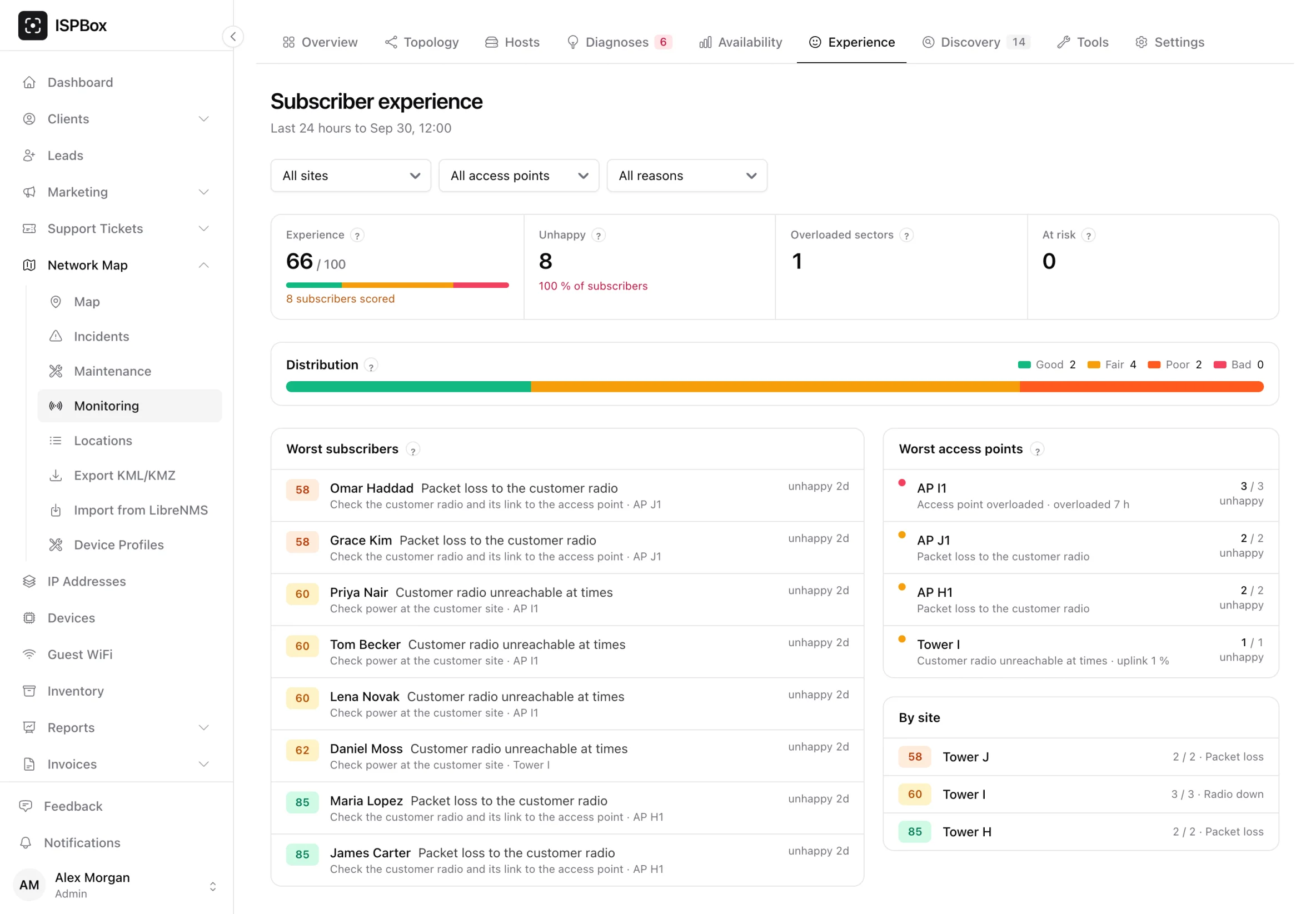
Network Map > Monitoring > Experience (also under Reports) shows:
- the workspace score and how many customers are good, fair, poor and bad,
- how many are unhappy, how many sectors are overloaded, how many customers are at risk,
- the worst subscribers, each with the reason in plain words, the next step and since when,
- the worst access points,
- filters by site, access point, package and reason.
The next step
Every reason comes with one thing to do: re-aim the dish, offer a plan upgrade ("saturated 38 h this week"), put a smart queue on the plan, check the power at the customer's side, or, for an overloaded sector, move customers or add capacity.
At risk
Customers who have been unhappy three days in a row and have an open ticket, asked for a cheaper plan or a suspension, or have an overdue invoice. It is a call list, read-only: nothing is sent or changed automatically.
On the client page and the access point
The client page shows each scored service's score, the last seven days as a strip, the reason and the next step. An access point's host page lists its customers' scores worst first, with the hours the sector was overloaded.
In the customer portal
If you switch on Show connection quality in the portal (Settings > Customer portal), customers see a My connection card: working normally, slower than usual, interrupted, or planned work in progress, a seven-day strip, and a tip only when they can act on it (their antenna signal is weak: Request a visit; they use their full speed often: See faster plans; their connection dropped a few times: check the power adapters). When the cause is on your side, a customer is never told to do anything. The subscriber app shows the same card.
Fair to planned work and to your calendar
- Hours during a maintenance window that reached a customer are scored and shown, but never count towards "unhappy" or "at risk".
- Days close at midnight in your workspace's time zone, not in UTC, so the strip matches your customer's week.
Good to know
- Scores are worked out every hour; the last hours are re-scored so late measurements count.
- Customer names on the page need permission to see clients.
- The score also makes the saturation, plan saturation and customer-side diagnoses more certain.
- Scores are in the REST API and the MCP server, as aggregates and reasons, never raw series.